

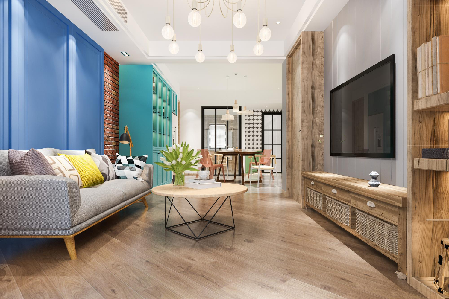
Color has the power to completely transform a space—especially when it comes to flooring. Luxury Vinyl Plank (LVP) offers endless design versatility, with shades ranging from soft, weathered grays to rich, golden browns. But before picking a hue that looks beautiful in a sample, it’s essential to understand how tone—warm vs cool—affects the atmosphere and harmony of a room. The right LVP color palette can make a home feel cozy and inviting or sleek and modern, depending on the undertones that tie everything together.
Understanding warm tones and their cozy appeal
Warm-toned LVP flooring features hints of red, orange, or yellow. Think honey oak, golden maple, chestnut, and caramel hues. These shades tend to create a sense of comfort and warmth, making large rooms feel more intimate and inviting.
Warm tones pair beautifully with natural sunlight, creating a glowing effect that feels timeless and welcoming. They work well with classic interiors, rustic spaces, and homes with earthy décor elements like terracotta, cream, or tan.
If the goal is to achieve that cozy, lived-in charm—like the feel of a countryside retreat or a Mediterranean-inspired home—warm LVP tones are a perfect fit.
Exploring cool tones for a fresh, modern vibe
Cool-toned LVP planks lean toward gray, taupe, or even bluish undertones. Examples include driftwood gray, weathered ash, and stone-inspired hues. These shades give spaces a sleek, modern look that’s both calming and sophisticated.
Cool tones tend to complement minimalist interiors, coastal designs, and homes with clean lines or contemporary finishes. They work exceptionally well with whites, blacks, blues, and silvers—making rooms appear larger and airier.
For homes with abundant natural light, cool tones can help balance brightness by adding a grounded, elegant touch.
How to identify undertones in LVP flooring
At first glance, two planks might look similar, but their undertones can shift how they appear under different lighting conditions. To determine undertones, compare your LVP sample against a sheet of white paper. Warm tones will reveal subtle hints of yellow, red, or gold, while cool tones will lean toward gray, blue, or green.
Always test samples in the room’s actual lighting—both daylight and evening light—to see how the color interacts with walls, furniture, and décor.
Balancing your room’s lighting and décor style
Lighting and décor play a major role in how flooring color feels within a space.
Natural light: Rooms flooded with sunlight tend to make warm tones look richer and cool tones appear softer.
Artificial light: Warm bulbs can enhance golden undertones, while LED or daylight bulbs intensify cooler shades.
Décor style: Traditional and rustic interiors pair best with warm LVP, while industrial, Scandinavian, or coastal themes lean toward cool palettes.
If a room has neutral décor, a mid-tone LVP that blends both warm and cool elements—like greige—offers a perfect balance and timeless appeal.
Mixing warm and cool tones like a designer
It’s entirely possible to mix both warm and cool tones in one home without creating visual tension. For example:
Use warm LVP floors with cool gray walls for a layered, dynamic effect.
Choose cool-toned flooring and add warmth through décor like brass hardware, wooden furniture, or beige textiles.
Maintain balance by repeating one tone in accents across rooms—like warm light fixtures or cool-toned area rugs—to achieve flow throughout the home.
This blend creates visual interest and gives interiors a more curated, designer feel.
Trends in LVP color palettes for 2026
Design trends continue to evolve, but one thing remains constant—neutral tones reign supreme. Homeowners today favor versatile LVP shades like light oak, sandy beige, weathered gray, and soft greige. These hues adapt to different styles and color schemes, making them ideal for long-term value and aesthetic flexibility.
Warm neutral LVPs add organic comfort that aligns with biophilic design trends, while cool neutrals fit perfectly in modern coastal and minimalist homes. Both tone families are timeless, but the choice ultimately depends on the mood and personality a homeowner wants to express.
How to make your flooring and décor speak the same language
When deciding between warm and cool tones, consider how each color interacts with furniture, cabinetry, and wall paint. If your décor features cool tones (like navy or gray), a cooler floor will feel more cohesive. If you have beige upholstery or wooden furniture, a warm LVP tone will naturally complement it.
Ultimately, your flooring should connect emotionally—reflecting comfort, personality, and style. Whether it’s the cozy glow of amber oak or the crisp serenity of driftwood gray, your choice sets the foundation for the entire design story of your home.
Contact Lakeway Floors today!
At Lakeway Floors, our flooring experts help homeowners across Lakeway, Bee Cave, Westlake, Dripping Springs, Spicewood, and the greater Austin area find the perfect LVP color palette for their homes. From warm, welcoming finishes to sleek, cool-toned designs, our selection makes it easy to fall in love with your home all over again. Schedule your free shop-at-home consultation today and experience how simple it can be to find the floor that fits your style and your life.


